In May 2020, I started as a designer at IBM working on the iti project. My first project was to conduct a discovery phase for the new app website, as the current one no longer met the needs of the application's new phase. We started by defining the stakeholders, where we decided that, in addition to the technical leaders of the squad, we would also involve the marketing team from iti, as they would be the main beneficiaries after its completion.
Due to the pandemic situation, a comprehensive usability test with our clients was almost impossible. So, we conducted some activities on Miro on a user-centered canvas with our stakeholders, where we defined some objectives based on the data we had at hand. For confidentiality reasons, I will not provide the numbers we used (and I concealed other sensitive information), but we decided to develop a mobile-focused website because access through them is much higher than on other platforms. Another important decision was that we should focus on the storytelling of the site and make it easier for customers to find answers to simple questions, thus relieving some pressure on our call center.
So, in addition to the product design team, business, technology, and marketing, we left the door open for customer service to be included as a stakeholder in the future.
Three main points of focus for the project at this time were:
1- The website, developed on the Adobe platform, should continue to allow quick customization by the marketing team, in a modular way and without the involvement of developers for day-to-day updates;
2- Our ranking on Google's website rank was not good, so the performance, which was very low, should increase significantly, both in terms of loading time and usability and SEO;
3- As with everything in iti's design, accessibility should be considered in all modules.
After the initial benchmark research with competitors, during our squad's internal kick-off, we decided to update the site gradually, module by module, rather than starting from scratch. Since we maintained the modular structure, the most logical thing to do was to develop new modules one by one and implement them as they were approved by the testing and accessibility team. So, over this year, there was an evolution of the site until it was completely revamped.
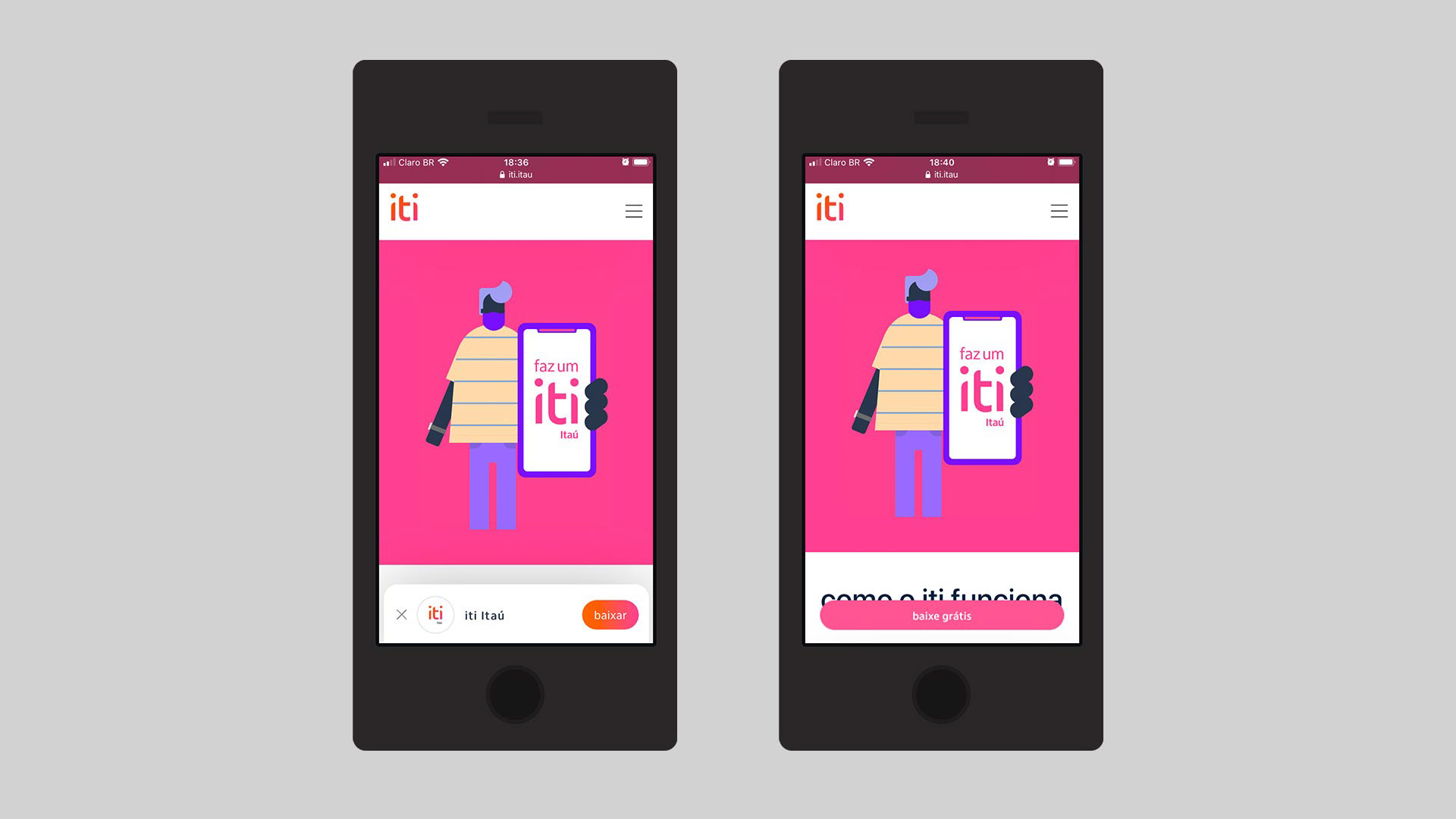
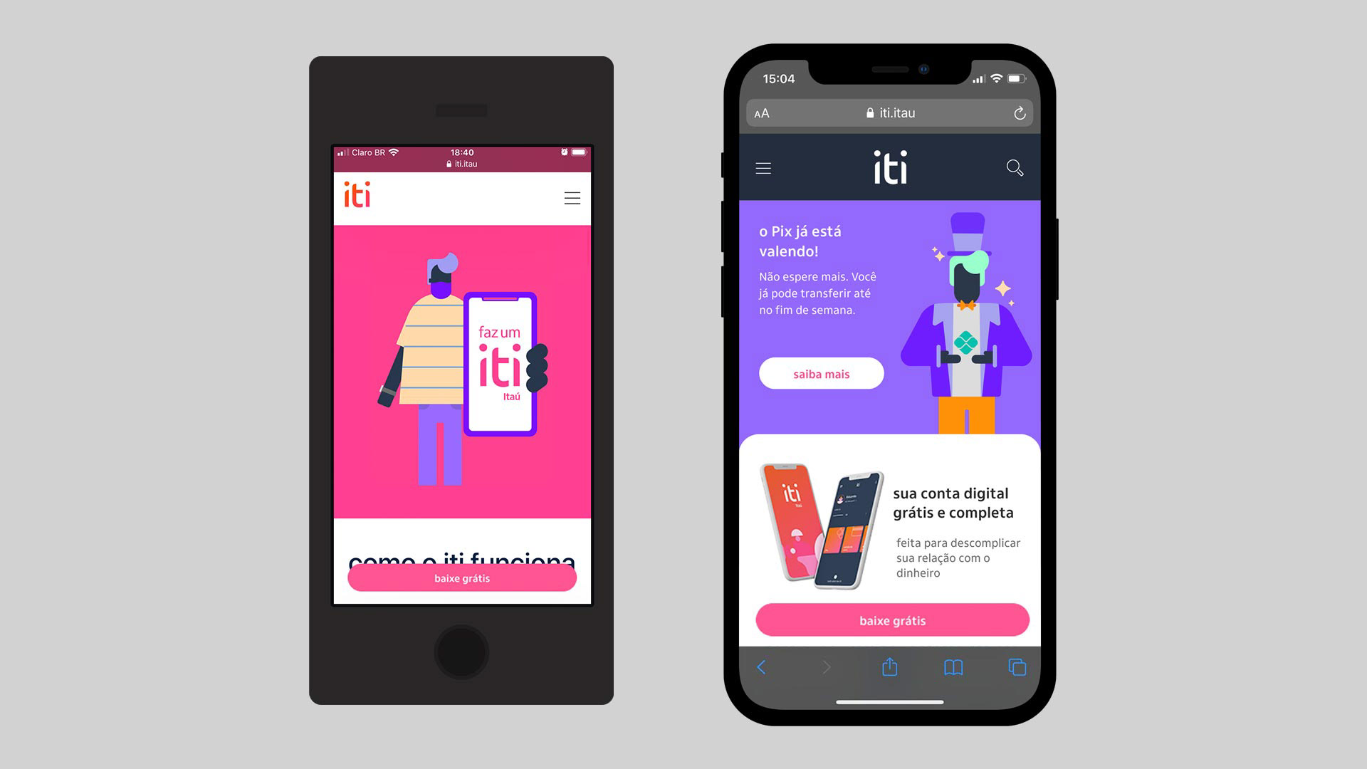
The first major structural change was to replace the floater that existed inviting the user to download the app with an imperative button, with the call-to-action "download for free." It couldn't be more direct. It was a simple adjustment, but it increased the conversion of new customers via the site by 20%.
Three main points of focus for the project at this time were:
1- The website, developed on the Adobe platform, should continue to allow quick customization by the marketing team, in a modular way and without the involvement of developers for day-to-day updates;
2- Our ranking on Google's website rank was not good, so the performance, which was very low, should increase significantly, both in terms of loading time and usability and SEO;
3- As with everything in iti's design, accessibility should be considered in all modules.
After the initial benchmark research with competitors, during our squad's internal kick-off, we decided to update the site gradually, module by module, rather than starting from scratch. Since we maintained the modular structure, the most logical thing to do was to develop new modules one by one and implement them as they were approved by the testing and accessibility team. So, over this year, there was an evolution of the site until it was completely revamped.
The first major structural change was to replace the floater that existed inviting the user to download the app with an imperative button, with the call-to-action "download for free." It couldn't be more direct. It was a simple adjustment, but it increased the conversion of new customers via the site by 20%.
Even with this change, the modules that were not optimized for mobile were a concern. However, before we could think about a new structure for the website, it was necessary to consider how the new content would be divided. To do this, we assembled a committee with members from the marketing team to outline the storytelling and usability of the new modules, which is where we began to design the prototype of the website we have today.
Based on the business needs and navigation metrics, we understood that having a prominent module and another one explaining what iti is would be ideal for the first section of the homepage. This would not only make it more visually appealing but also provide immediate information for existing customers and new visitors looking to learn about iti.
Based on the business needs and navigation metrics, we understood that having a prominent module and another one explaining what iti is would be ideal for the first section of the homepage. This would not only make it more visually appealing but also provide immediate information for existing customers and new visitors looking to learn about iti.
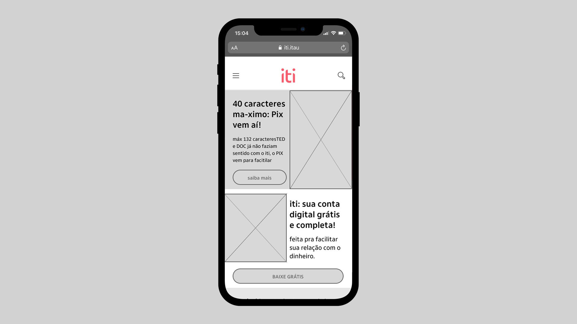
As we were also concurrently developing a page for the launch of Pix, we used the content we intended to use on that page as a basis for new modules. This turned out to be a very wise decision in the future, as we were able to reuse some of them in the wireframe of the new homepage of the website.
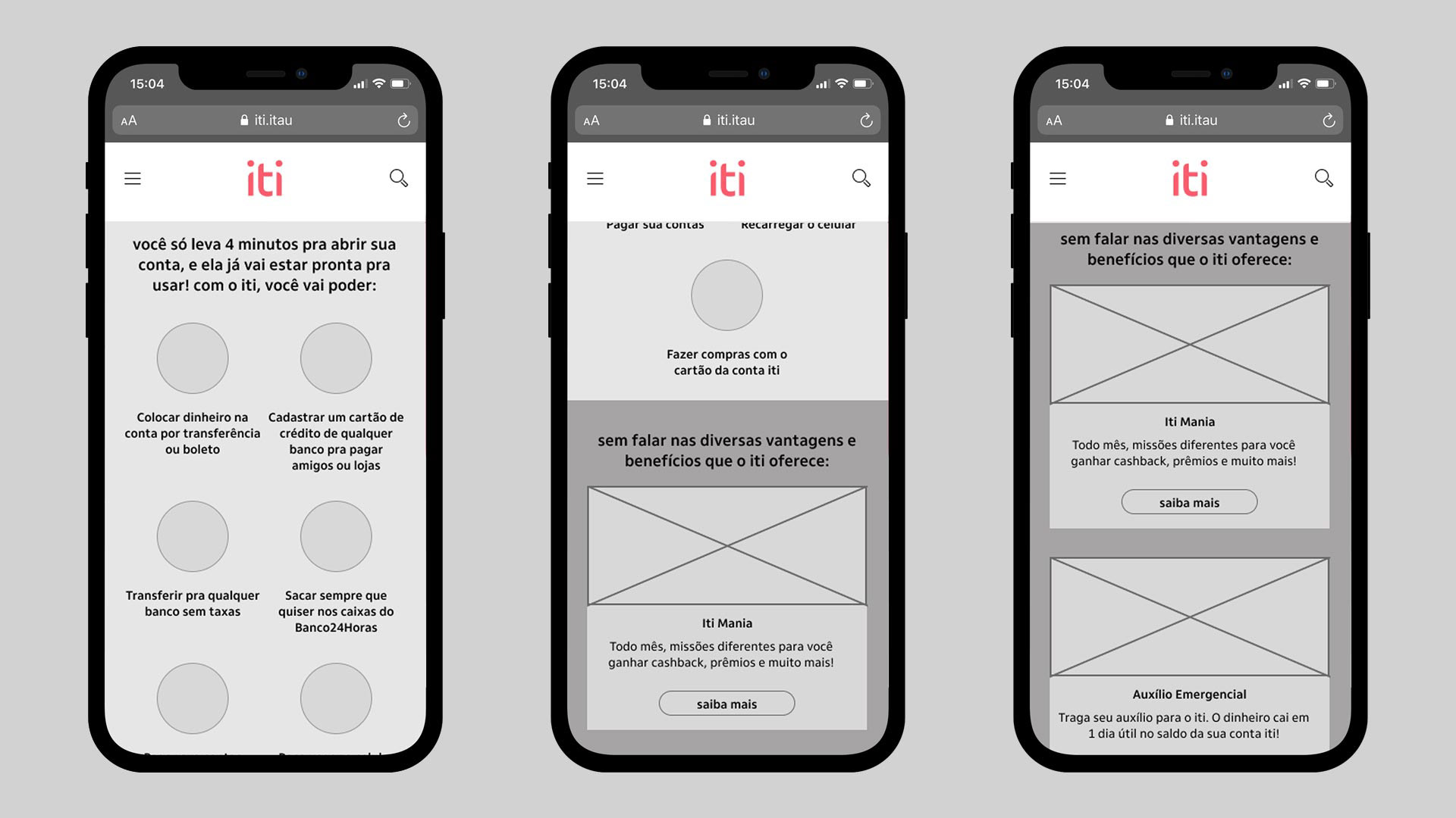
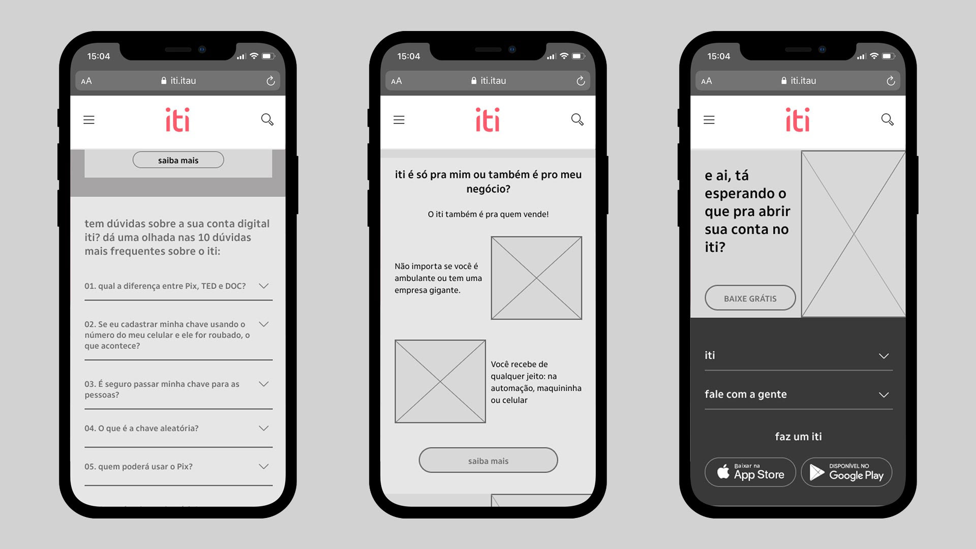
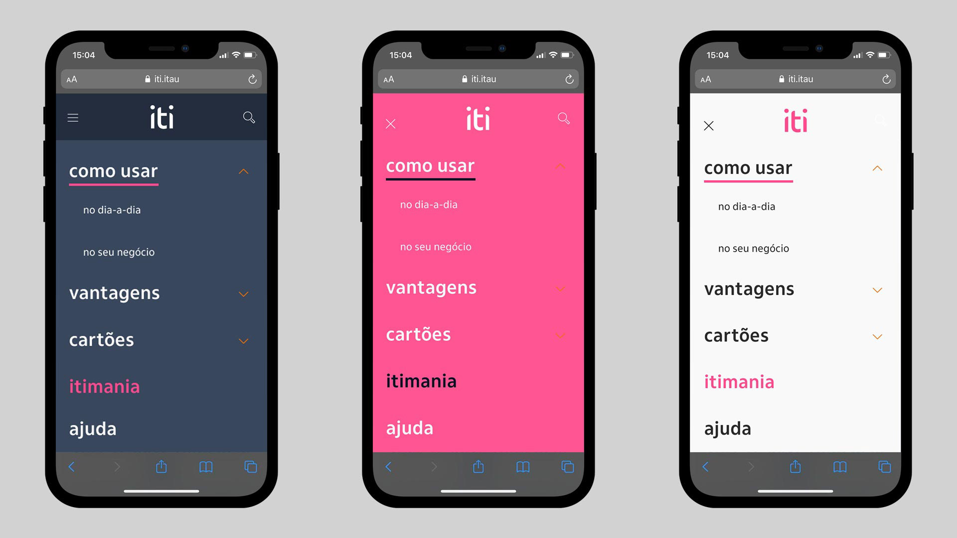
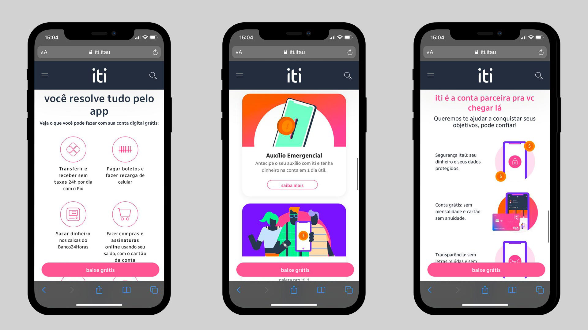
With the scope of the homepage finalized, we decided to move on to refining the design, and it was time to divide tasks. While the marketing team would work on the final texts for the homepage and internal pages, already knowing which new modules we would have available, I started working on the layouts, aiming for best practices for both images and text. To do this, I developed a site manual, which would serve as a support for both designers and UX writers who needed to create new pages with the existing modules, providing information on image sizes, weights, and formats, as well as best practices for text and a guide to facilitate the authoring of new requests. So, module by module, we began to design the redesign, as shown in the before/after images below.
Although not all planned features are used initially, after a year, we delivered, in addition to the menu redesign, 16 new responsive modules optimized for mobile, all of which can vary in text, image, color, and, most importantly, extensively tested by the accessibility team. Since not all of them are being used, I will show here only a few examples of those that are already live, as they form the foundation being used for all other pages.

Check the website here